Green Energy in Europe
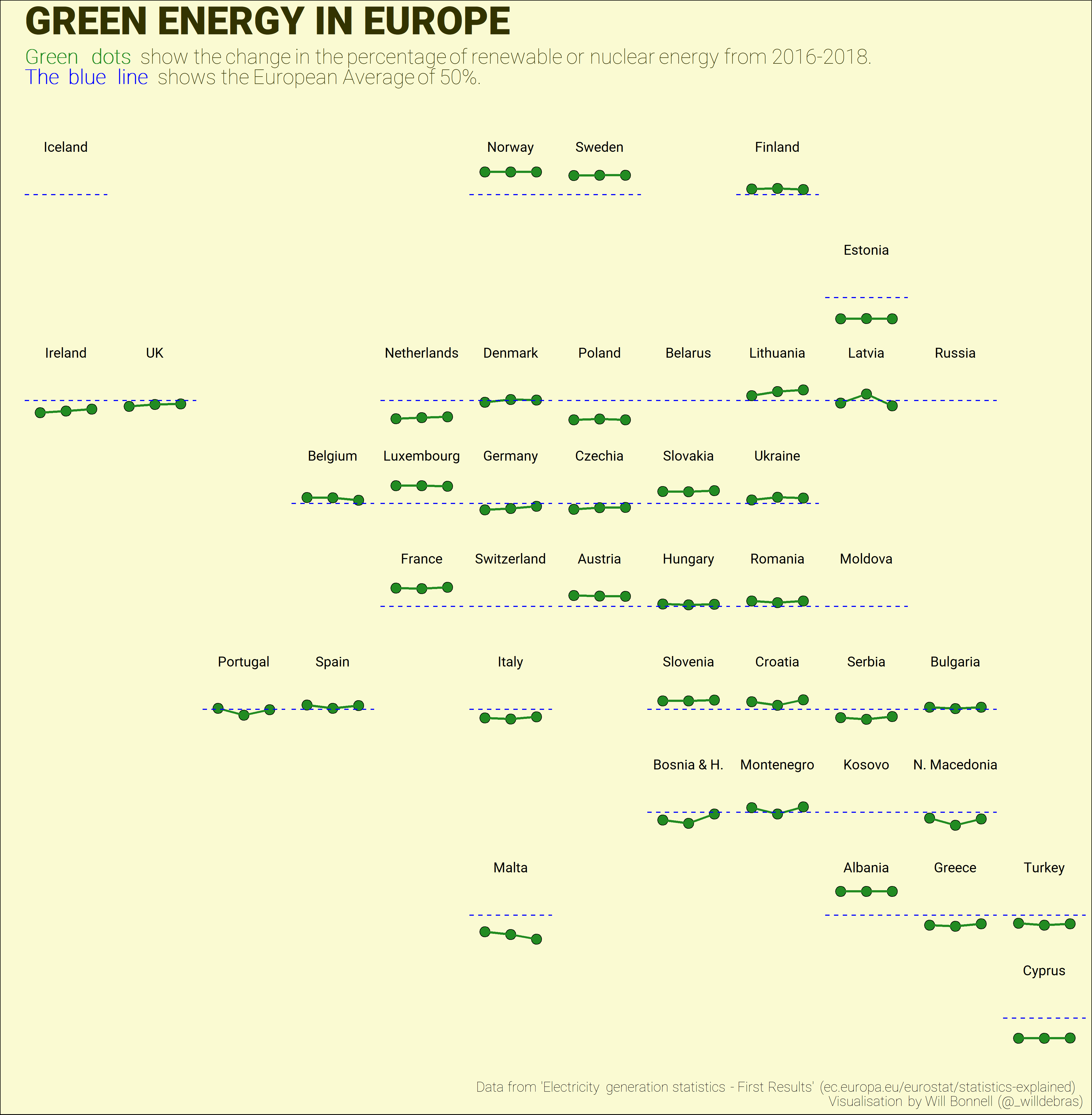
This visualisation was created for a Tidy Tuesday challenge of energy usage in Europe.
It features an attractive layout of all the European countries and how their use of renewable or nuclear energy changed from 2016 to 2018, compared to the European average of ~50%. Click the image for the full resolution SVG.
