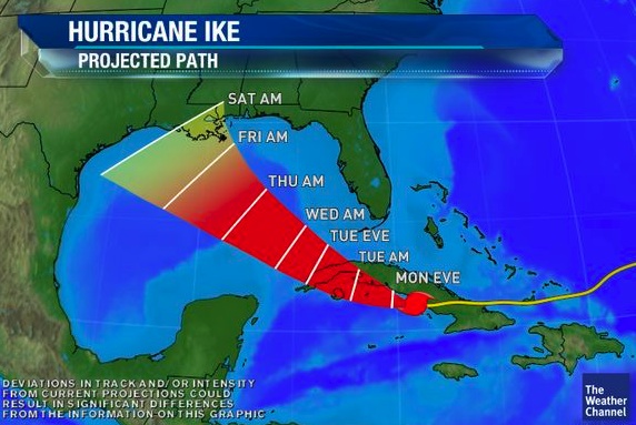
class: center, middle, inverse, title-slide # Visualizing Uncertainty in R ## hurricanes, spaghetti, and hypothetical outcome plots ### Will Bonnell ### 2018/04/26 --- <style type="text/css"> .remark-code, .remark-inline-code { background: #f0f0f0; } .remark-code { font-size: 12px; } .huge .remark-code { /*Change made here*/ font-size: 200% !important; } .tiny .remark-code { /*Change made here*/ font-size: 70% !important; } </style> .pull-left[ ### What is the problem 1. Action-accuracy gap<sup>1</sup> 1. Status quo of easily misinterpretable dataviz 1. Misconveyed info leads to loss of credibility of researchers ### What can we do 1. Frequency framing 1. Express potential outcomes ] .pull-right[ <br>  ] .footnote[ [1] (Hullman 2018) ] --- class: inverse, center, middle #The Status Quo --- ##Cones of Uncertainty  Image credit: [Cornell Risk Communication Research Group](https://www.risk.comm.cornell.edu/research_briefs/the-cone-of-uncertainty/) --- ###Reimagined ```r map <- get_map(location = c(lon = -72, lat = 24), zoom = 5, maptype = "satellite") g <- ggmap(map, extent = "device") + geom_path(data = hurricane1, aes(x = lon, y = lat, group = hurricane), colour = "#ff4500", size = 1, alpha = 0.6) + geom_point(data = hurricane1, aes(x = lon, y = lat), size = 2, alpha = 0.9, colour = "#ff0800") + geom_text(data = hurricane1[1,], aes(x = lon, y = lat), size = 10, label = emoji("cyclone")) + coord_fixed(ylim=c(16, 34)) g ``` <img src="index_files/figure-html/plo-1.png" style="display: block; margin: auto;" /> --- #Error bars and violins .pull-left[ <!-- --> ] .pull-right[ <!-- --> ] --- class: inverse, center, middle #Potential Replacement --- ##Hypothetical Outcome Plots 1. Animated plots to show potential values or probabilities 1. Allow individuals to think in finite terms (counts) instead of inifinite terms (probabilities) 1. Outperformed error bars and violin plots in assessing respondents ability to predict probability that B > A<sup>2</sup> .footnote[ [2] (Hullman 2015) ] --- Plotting potential real values ```r ggplot(mtv_hyp, aes(age, probability)) + geom_errorbar(aes(ymin = probability, ymax = probability)) + theme_minimal() + theme(axis.title.y = element_text(margin = margin(r = 20))) + # its animated yo transition_states( simulation, transition_length = 2, state_length = 1) + enter_fade() + exit_shrink() + ease_aes('sine-in-out') + shadow_mark(past = TRUE, future = TRUE, color = "#d3d3d3") + labs(x = "Age", y = "Percentage") ``` <img src="index_files/figure-html/ani-1.gif" style="display: block; margin: auto;" /> --- ###Distribution example ```r mb <- microbenchmark(x, y, n = 50) ggplot2::autoplot(mb) + theme_minimal ```  --- ###Hypothetical runtimes ```r ggplot(mb1, aes(expr, time)) + geom_errorbar(aes(ymin = time, ymax = time)) + theme_minimal() + theme(axis.title.y = element_text(margin = margin(r = 20))) + transition_states(frame, transition_length = 2, state_length = 1) + enter_fade() + exit_shrink() + ease_aes('sine-in-out') + shadow_mark(past = TRUE, future = TRUE, color = "#d3d3d3") + labs(x = "Function", y = "Time to run") ``` <img src="index_files/figure-html/final-1.gif" style="display: block; margin: auto;" /> --- class: center, middle # Thanks! Slides created via the R package [**xaringan**](https://github.com/yihui/xaringan). Twitter: [@_willdebras](https://twitter.com/_willdebras) --- ##References: [Hullman, et al. 2015](https://journals.plos.org/plosone/article?id=10.1371/journal.pone.0142444)