
Will Bonnell
December 1, 2020
Custom datatable Tooltips in Shiny
Tooltips
If you’ve used a web browser or a programming IDE, you’ve almost certainly come across a tooltip. While tooltips can serve to clarify information in a webpage, natively they also obscure it. These bubbles of information require a user to hover over an element to see the tooltip and get the information. A user might not be aware that this information exists or users using screen-readers might never come across this tooltip.
When they are useful
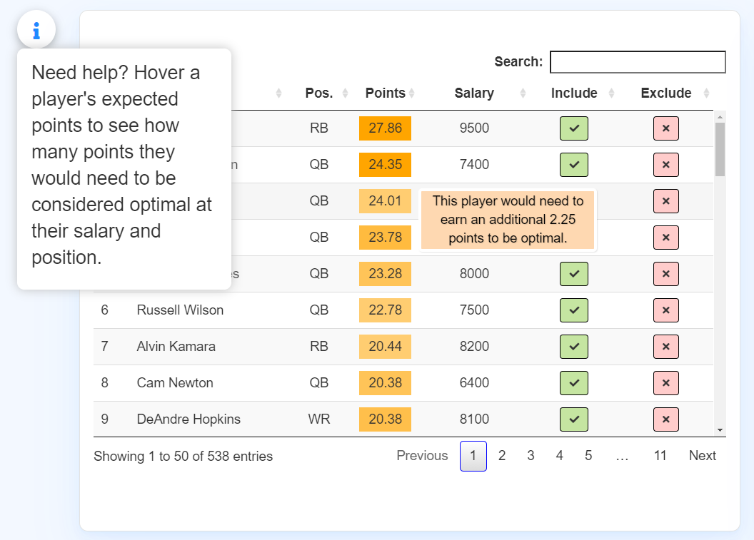
While tooltips might obscure information, I believe they can be helpful when a user explicitly knows they are there and when they are well-defined in terms of size, color, and outline. For example, in this table for a web application I recently helped create, I include a toggle-tip element to let a user know they can hover and find information. This information is then clearly defined for the user.
The cursed title attr
Natively, tooltips are usually assigned to the “title” attr or attribute in a webpage.
While these can serve as clarifying information and are native HTML elements requiring no CSS, JS, or other tools, they are not the prettiest way of conveying information and they can present issues in terms of accessibility. This attribute does not show up while inspecting a webpage, therefore it usually will not show up in screen-readers.
Custom CSS tooltips
One way to ensure accessibility to screen-readers and improve the attractiveness of the tooltip is to create a new element and apply CSS to it to display on hover. A screen reader will pick up this element because it will be defined in the appropriate div or container and we can improve the visibility and attractiveness of the tip.
To create this tooltip for each cell in the example above for our table of fantasy football players, we will need code in two places.
- a JS callback in the datatable call to create this attribute and stylize it
- some CSS code to change the visibility on hover and focus
Callbacks
The callack and rowCallback parameters of the datatable API are used for a variety of post-processing. We could adjust CSS, specific widths and alignments, and apply or change attributes all based on row, column, or individual cell.
For our callback to add this tooltip, we can include code that looks like this:
datatable(reactive_table(),
          rowCallback = JS("function(nRow, aData, iDisplayIndex, iDisplayIndexFull) {",

                 "var full_text = 'Tooltip text goes here.'",

                 "$('td:eq(3)', nRow).attr('data-title', full_text);"
                 )
)
This rowCallback call lets us process each row before it is rendered with specific Javascript.
This code will say for nRow in the reactive_table() identified by aData, we are going to perform a function for each index. The function we give it creates a var called full_text that defines the text we want to display on hover.
The final line of code specifies that to the td element (a datum or cell in a table in html), we are calling the eq() function to target the third element (the third column of the table) iterated over each row. To that we are applying an attribute with .attr called data-title with our variable that we specify above. This will create an attribute that we can then display when hovered.
We can consider adding more complicated logic to improve this functionality even more. For example, we can customize this tip based on data in our reactive_table().
datatable(reactive_table(),
rowCallback = JS("function(nRow, aData, iDisplayIndex, iDisplayIndexFull) {",
"if (aData[5]==0) {",
"var full_text = 'This player is in the most optimal lineup.' }",
"else {",
"var full_text = 'This player would need to earn an additional '
+ aData[5] + ' points to be optimal.' ",
"};",
"$('td:eq(3)', nRow).attr('data-title', full_text);",
"$('td:eq(3)', nRow).css('cursor', 'help');"
)
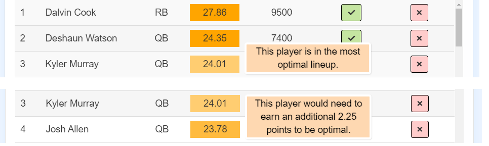
)In this example we refer to a different index of our data to generate this tooltip. If a player needs more points to be considered in our optimizer, we return a tooltip that pipes in the piece of information, which is stored in our fifth column of reactive_table(). If they need 0 more points, we give a custom message saying they are already optimal.
We also add CSS to the same element to change the cursor to the help cursor.
We can see the output of the differing tooltips here:
the CSS
The last step is to prettify these and ensure they remain hidden until you hover over the associated cell. We include several chunks of CSS in the styles.css sheet of our www folder in our shiny application.
We include three chunks:
First, we include a chunk to define these attributes to have a relative position as to not displace other elements in our table.
[data-title] {
    position: relative;
}
We use the square bracket selectors [] to specify that we are applying this style to all elements with the data-title attribute. (In this case, they are the cells of the data that have this attribute applied.)
Next, we add the actual tooltip information with our styles.
[data-title]:after {
    content: attr(data-title);
    background-color: #fed8b1;
    color: black;
    font-size: 100%;
    width:250px;
    padding: 1px 5px 2px 5px;
    bottom: -2.5em;
      border: 4px solid rgb(255, 255, 255);
      border-radius: 5px;
    left: 100%;
    position: absolute;
    z-index: 99999;
    visibility: hidden;
}
Here we specify several things. We tell CSS we want to insert some text after the elements with the data-title attributes. element::after{content: text} lets us apply text directly after an element. A useful example of this is including a url after a link.
In this case, we give it the content of the actual attribute. This is the text we defined to it in our callback above. Next in our code, we specify things like color and font-size. We also give it width and border elements, as well as padding to define a box for our tooltip.
Importantly, we define several things at the end:
- We tell it
left:100%to displace it fully to the right of the cell element, so we can still see the contents of that cell. - We give it a position of absolute and a very high
z-indexto ensure it is locked in place on top of all other elements and is not obscured by the table itself. - We set the
visibilitytohiddenandopacityto 0 so it will not be displayed until it is hovered.
Lastly, we add CSS to ensure these are displayed on hover.
[data-title]:hover:after {
    opacity: 1;
    transition: all 0.1s ease 0.5s;
    visibility: visible;
}
This code will change the opacity and visibility to display after the cell (to the right of the cell) when that cell is hovered.
A note on accessibility
While this final product creates a much more beautiful and accessible tooltip than our cursed title attribute, there are other things we can consider when it comes to accessibility. Our tooltip is still impossible to be seen by those who do not use a mouse and might only use a keyboard to select elements of a webpage. We can add another chunk of CSS to ensure that when a keyboard user focuses on an element (try tabbing in this webpage to see how you can focus elements) the tooltip would display:
[data-title]:hover:after {
    opacity: 1;
    transition: all 0.1s ease 0.5s;
    visibility: visible;
}
While this still might present issues for a user using a touch-screen to select elements, e.g. on mobile, it still greatly improves the accessibility of our tooltips.
To learn more about other ways developers can make tooltips more accessible, check out this great blog post by Heydon Pickering at Inclusive Components: