
Will Bonnell
February 5, 2020
Hypothetical Outcome Plots
The Uncertainty of Uncertainty
Conveying uncertainty in data visualisations has become a growing topic in data visualisation circles in the past few years. When considering how to visualise data, one must consider who their audience is and how that audience might interpret a visualisation. In the same way writers adopt different styles of writing to convey information to different audiences, dataviz practitioners might choose color, layout, or typography to suit different audiences (e.g. making a color palette color blind friendly or right-aligning a visualization designed for RTL-writing communities). The options a dataviz practitioner has though are not limited only to the aesthetic design choices. The practitioner’s decision to use a certain type of visualisation itself is contingent on the audience’s ability to understand it.
This is especially true when visualising the uncertainty we as researchers know exist. While a statistician or analyst in your company or academic department might understand the error bars on a bar chart you send them, the average person might not. This has prompted discussion about ways we visualise uncertainty.
How We Historically Visualise Uncertainty
Conventionally, one might express the uncertainty of a mean value by creating a confidence interval of the difference of a mean and standard deviation. We could express that deviation in an error bar, like such:
library(ggplot2)
library(dplyr)
##
## Attaching package: 'dplyr'
## The following objects are masked from 'package:stats':
##
##     filter, lag
## The following objects are masked from 'package:base':
##
##     intersect, setdiff, setequal, union

iris_sum <- iris %>%
  group_by(Species) %>%
  summarise(mean = mean(Petal.Length),
            sd = sd(Petal.Length))
## `summarise()` ungrouping output (override with `.groups` argument)

g <- ggplot(iris_sum, aes(Species, mean, fill = Species)) +
  geom_col() +
  geom_errorbar(aes(ymin = mean - sd, ymax = mean + sd), width = 0.2) +
  labs(y = "Petal length") +
  theme_minimal()
g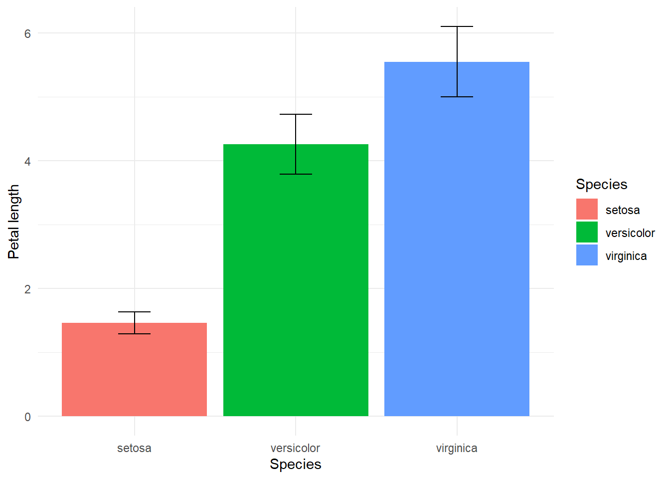
While this creates clarity that there is some uncertainty, it might also convey that probabilistically the likelihood of this value can only fall in this bar and is equally likely to be any point within these bars. One might be able to better express this uncertainty by creating a violin plot of distributions of simualated or real values.
Say we ran a benchmark on two functions to test if one was faster than another. We could run it a few hundred times and create distributions of these two benchmarks and plot them:
mb <- microbenchmark(x, y, n = 50)
ggplot2::autoplot(mb) +
  theme_minimal()
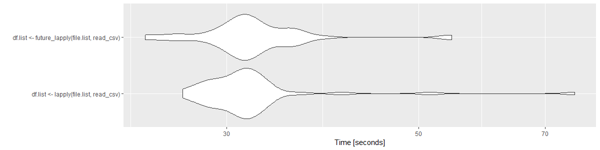
These plots are great for allowing an individual to infer density of values (or probabilities). They could potentially say “about 50% of all tests in both of these tests fall around 30-35 seconds.” This is good for conveying the inference that these tests do not have much difference in run time.
Alternatives
In the era of modern data visualisation we have more tools at hand than conventional depictions of uncertainty in error bars or violin plots. A recent development in conveying of uncertainty is the innovation of hypothetical outcome plots (HOPs), which are animated plots or graphs that show potential values in a distribution (e.g. Bayesian MCMC sampled data, bootstrapped data, or a real distribution like our plot above).
HOPs have the advantage of requiring relatively little background knowledge to interpret as they only require a viewer to understand a single real value at different times. In testing on subjects, these outperformed error bars consistently and outperformed violin plots in certain one-variable trials. Subjects were better able to estimate cumulative densities when variance was low when using HOPs than violin plots or error bars.
Creating HOPs
Creating HOPs in R is pretty simple with {gganimate}. For a one-variable trials like Hullman, Resnick, and Adar create, we can use geom_errorbar() as we did above, but we will add a transition_states() call to animate it.
Let’s look at our benchmark data:
mb <- read.csv("../../content/posts/mbtest.csv")
head(mb)
##   X                                          expr        time
## 1 1        df.list <- lapply(file.list, read_csv) 17483605629
## 2 2 df.list <- future_lapply(file.list, read_csv) 11911994096
## 3 3 df.list <- future_lapply(file.list, read_csv)  9941619312
## 4 4        df.list <- lapply(file.list, read_csv) 17726280555
## 5 5 df.list <- future_lapply(file.list, read_csv) 12778679896
## 6 6        df.list <- lapply(file.list, read_csv) 20202289703
We simply need to assign frame to each of these expressions and then set the transition_states() function to reference frame. In this case we want frame to equal 1 for one of each function, and then frame to equal 2 for one of each function, and so on. We can just use the rep function to assign this column. Frame should be unique for whatever you are animating. This is the output we will feed into our ggplot:
mb1 <- mb %>%
  mutate(expr = as.character(expr)) %>%
  mutate(frame = rep(1:(100/2), each = 2))

head(mb1)
##   X                                          expr        time frame
## 1 1        df.list <- lapply(file.list, read_csv) 17483605629     1
## 2 2 df.list <- future_lapply(file.list, read_csv) 11911994096     1
## 3 3 df.list <- future_lapply(file.list, read_csv)  9941619312     2
## 4 4        df.list <- lapply(file.list, read_csv) 17726280555     2
## 5 5 df.list <- future_lapply(file.list, read_csv) 12778679896     3
## 6 6        df.list <- lapply(file.list, read_csv) 20202289703     3
Then we create our ggplot() with the data argument set to the data set and the aesthetics set to expr and time like we would set up a normal bar chart, but instead of using geom_bar() we will just use geom_errorbar() and then animate its movement. We set transition_states() to reference the frame column and then can set the transition_length parameter to equal 2 frames.
library(gganimate)
library(gifski)
## Warning: package 'gifski' was built under R version 4.0.3
ggplot(mb1, aes(expr, time)) +
  geom_errorbar(aes(ymin = time, ymax = time)) +
  theme_minimal() +
  theme(axis.title.y = element_text(margin = margin(r = 20))) +
  transition_states(frame, transition_length = 2, state_length = 1) +
  enter_fade() +
exit_shrink() 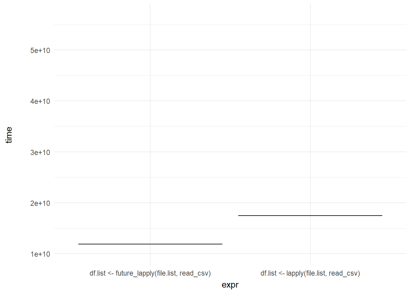
We can then add a shadow_mark() element to keep the past and future frames of the animation so you can see all the potential values and set these to a light grey so they don’t interrupt the animation:
ggplot(mb1, aes(expr, time)) +
  geom_errorbar(aes(ymin = time, ymax = time)) +
  theme_minimal() +
  theme(axis.title.y = element_text(margin = margin(r = 20))) +
  transition_states(frame, transition_length = 2, state_length = 1) +
  enter_fade() +
  exit_shrink() +
  ease_aes('sine-in-out') +
  shadow_mark(past = TRUE, future = TRUE, color = "#d3d3d3") +
  labs(x = "Function", y = "Time to run")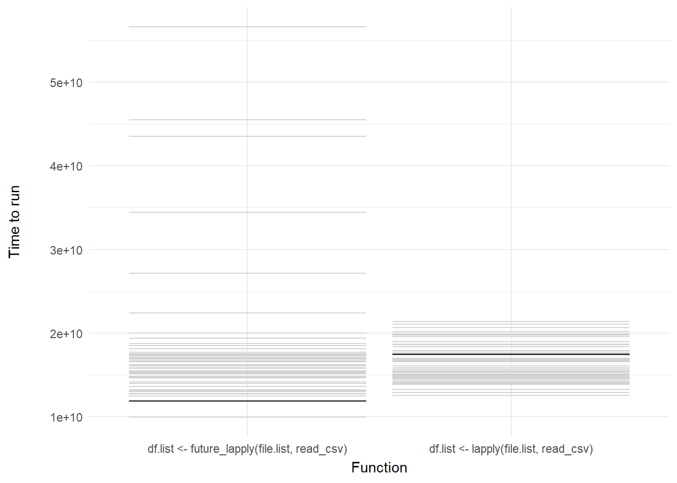
Voila! We have our first one-variable hypothetical outcome plot representing the distribution of our code benchmarks above.
More examples
For more information about how one can create synthetic/simulated data for the creation of HOPs, I recommend Claus Wilke’s rstudio::conf 2019 presentation on the subject. His slides have examples of bootstrapping and sampling data for inclusion in HOPs.